animated charts in python and Qt
I’m currently trying to generated interactive (and animated) charts in Python + Qt. The wanted library would be:
- portable: this is one of the reasons of the choice of PyQt
- simple: same reason
- interactive: I want to be able to select, for example, the slices of a pie chart. A signal of events like Qt’s would be perfect
- animated: this is useless, but looking at things like AnyChart or FusionCharts, the result is really nice !
- light on dependencies: relying on tons of libs makes the project hard to maintain and not portable, especially for windows where there is not packaging and dependency system.
- free software
A quick search gave me the following products:
- matplotlib: mostly for scientific plots, but there is a nice number of options, a well-documented API.
- pyQwt: Python bindings for Qwt. Again, it’s more scientific plot than charts
- cairoplot: projects looks dead (or in the "yeah, the project’s not finished, but we’re recoding it in \$LANG to be faster" syndrome, which is more or less the same). It generates images, though item maps can be extracted. The name tells it, it uses Cairo.
- pyCha: some nice charts, uses Cairo. Very simple API (not much options).
- reportlab: not really for interactive applications, but it can generate charts (and images).
- KD Charts: not tested. It looks nice, but the license is not free.
- ChartDirector: not free
Globally, the result is quite a deception:
- There is no immediate reply (yes, I’m lazy).
- Cairo is nice for Linux projects, but is a pain to use on other platforms
- There is nothing using Qt only, except PyQwt which cannot be used directly :/ This is surprising, especially given that Qt’s API is really nice and almost offers the solution natively.
- Charts libraries for web apps are easy to use, there seems to be nothing easy on desktop apps.
Custom version
This was pretty simple (at the beginning, at least): Qt provides two classes, QGraphicsView and QGraphicsScene, to draw objects. These classes are pretty good, and adding a PieChart, for ex, was only a matter of calculating the slices:
for d in data:
   (l,v) = d
   start_angle = sum
   span = (v*360 / self.current_sum)
   el = QGraphicsEllipseItem(0, - ELLIPSE_RADIUS, ELLIPSE_RADIUS, ELLIPSE_RADIUS)
   el.setStartAngle(start_angle*16)
   el.setSpanAngle(span*16)
To do the animation, just create a QTimer, and redraw the scene in the event handler. The setSpanAngle function can be use, for example, to display the slices regularly in 20 steps, drawing (360/20) degrees of the total Pie at each step:
current_step = (self.i+1) * (360/20)
if (current_step >= o._start_angle):
   o.setVisible(True)
   if current_step > o._start_angle + o._span_angle:
      o.setSpanAngle( o._span_angle * 16 )
   else:
      o.setSpanAngle( 16 * (current_step - o._start_angle) )
Using all features of Qt is pretty simple, like brushes to create a gradient etc. data are stored in a model, and catching events allows to redraw the scene smoothly whensomething is changed.
This solution is implemented in PyQt only (and could easily be in Qt only), has no extra dependency, and is reasonably fast. Using Qt objects natively allows to use events like hover, click in a very trivial way.
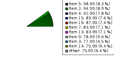
Code is stored in a git repository. I’ve named it Cutie Chart, which is a pretty bad pun (I’ll say I’m almost sorry):
git clone http://git.wzdftpd.net/cutie-chart.git
The repository also contains animation on Bar Charts, scaling each bar progressively to its normal size.
Example of result:
Matplotlib version
Using matplotlib would simplify things a lot, and bring tons of existing classes to the projects. However, things may not be so easy.
matplotlib provides a class FigureCanvasQTAgg. This class is a Qt canvas, so it can be used as a widget.
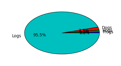
You have to create a Figure, a subplot and draw the pie:
fig = Figure(figsize=(width, height), dpi=dpi)
self.axes = fig.add_subplot(111)
self.axes.hold(False)
self.axes.plot([0.1, 0.1, 0.8, 0.8])
(patches, texts, autotexts) = self.axes.pie(self.data, explode=self.explode, labels=self.labels, colors=self.colors, autopct='%1.1f%%', shadow=True)
The animation is a bit trickier: changing the span angle is not possible. I’ve tried several options with no success (like using Transform etc.), until I decided to create a different animation, better suited for matplotlib. In this version, we add a dummy slice, to create the effect that each slice starts at 0% and grow to its proportion regularly. As previously, we use a QTimer:
s = sum(self.data)
i = self.i
self.anim_fracs[-1] = (s*(20-i)/i)

self.axes.pie(self.anim_fracs, colors=self.colors, labels=self.anim_labels, autopct='%1.1f%%')
self.draw()
Code will be committed in the same repository soon. I’ve uploaded the current file here
It works fine, and using matplotlib is nice, with many features and support classes (for ex the ability to create SVG or PDF, to have many other classes for charts etc). Matplotlib also handle the automatic placement of the legend, 3d effects, z-shape, which would take some time to add manually ;). However, the drawback is that the integration with Qt is limited, like the support of signals or interaction on objects.
Example of output: